Responsive web design principles are important. Building websites is about more than just aesthetics. You can build the nicest looking website, but all your efforts will be for nothing if the end result:
- Doesn’t run well on different devices
- Isn’t easy to use
- Doesn’t intuitively show its information
Functionality is a crucial part of an effective website. This is why website designers need to implement responsive web design.
What is responsive web design?
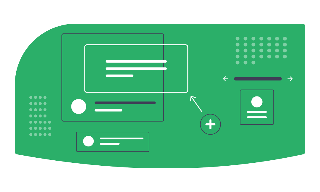
Responsive web design is a modern approach to designing website content in which a website needs to be able to seamlessly shift its content to accommodate a variety of factors. These factors include both the orientation and screen size of the user’s device.
Responsive web design is a more effective alternative to adaptive web design, in which a device selects one of several predetermined layouts to try and meet the dimensions of an internet browsing device.
What are the principles of responsive web design?
Responsive web design is a multi-faceted approach to building content for a website. There isn’t a single step to building a responsive website (otherwise, this would be a short blog post).
Instead there are several responsive web design principles that should be implemented in conjunction in order to construct a website that can function across all devices and orientations. We have listed them below for reference.
Breakpoints
Breakpoints make up the structure of a responsive website. They serve as the points that content will shift to based on the screen being used. Specifically, they are pixel values that trigger transformations in responsive websites when they are met. These design transformations ensure that text is easy to read and information is easy to access. For example, a desktop website might organise its content into three columns while the mobile version would organise that content into a single column.
Content Flow
When the screen size decreases, content is forced into taking up more vertical space. This can lead to content overlap if a website is not developed properly, making said content difficult to read. On responsive websites, all content underneath the text moves downwards to accommodate the text’s accumulation of vertical space.
Maximum and Minimum Values
Setting maximum and minimum values means establishing limits for how far responsive content can stretch across different screen sizes. This makes sense when you consider the difference in length between a mobile phone screen and other devices such as TV screens. What is easy to read on one screen can become difficult to read when stretched across the entire length of another.
On its own, a piece of content set to a width of 100% will stretch across the screen. However, an additional max width of 1000px will make sure that the piece of content will not exceed that width. The end result is a piece of content that will stretch as far as it can until it hits that limit.
Nesting Objects
Nesting objects is a method of grouping multiple objects into a single container. This means that, when content is prompted to move due to a change in screen, these particular objects move relative to each other as opposed to on their own.
This allows for a larger degree of control over content, as you can define what objects you want to scale and which ones you don’t. As a result, content is not going to overlap when dealing with less conventional screen sizes, resulting in a tidier and easier to understand website.
Relative Units
Because screen sizes vary so drastically, it can be difficult to scale content effectively with hard units such as pixels. Relative units, such as percentages scale content in direct relation to the dimensions of a screen as opposed to a set pixel value.
For example, content that is 400px will stay 400px on other screens unless otherwise specified. However, setting a content’s width to 50% means that it will always take up 50% of the screen, regardless of the device it is being viewed on.
Vector Images instead of Bitmaps
Vector images are different forms of image files that contain lossless quality. While they aren’t as good at presenting detailed images the way that raster images such as bitmaps are, they are great for simpler shapes and responsive websites because they are infinitely scalable without a loss in quality.
Webfonts instead of System Fonts
System fonts might look good, but they are not universal to multiple devices. If a user does not already have a system font on their device, one of two things will happen. Either the website will download the system fonts, which will slow its loading time down, or the website will resort to a default font, which will potentially ruin the website’s aesthetic and make its content difficult to read.
Webfonts aren’t perfect either. Because they come preloaded, having multiple different fonts can slow down page loading times. However, their usage is more likely to support the design of a responsive website than system fonts.
What are the advantages of responsive web design?
Why do modern web designers gravitate towards responsive web design? Not only does it improve the usability of a website, but it also has the capacity to boost a website’s SEO rankings when implemented correctly. Below are some of the reasons that we encourage responsive web design.
Avoiding Duplicate Content
One of the reasons that Google can penalise a website and lower its Google ranking is duplicate content. When designers decide to build a dedicated mobile version of their website, they run the risk of Google not being able to recognise which website version is more important, as the content remains largely the same.
Even if you use a canonical tag to define your desktop site as more important, you’re still putting yourself at an unnecessary disadvantage because the likelihood is that your mobile website won’t even rank at all.
With responsive web design, you’re using the exact same website, but you’re only shifting the position of the content, not duplicating it, so you’re avoiding all of these aforementioned problems.
Easier Website Development/Maintenance
When you employ responsive web design, you’re only dealing with a single website, which means that you only have to dedicate your time and resources to a single website as opposed to one for desktop and mobile.
Not only does this make maintenance easier, because you don’t have to view two different sets of analytics and develop fixes for both a desktop website and its mobile counterpart, it also makes development easier because you only need to make a single batch of scalable content.
Faster Loading Times
Because responsive web design content is scalable, its load times change relatively to the size of their device, which makes them load faster than static content which does not change. This means that websites with responsive web design tend to have lower bounce rates because their content loads quickly.
Higher Google Rankings
Since April 2015, Google has taken a website’s responsiveness into consideration when determining its ranking in the Search Engine Results Page (SERP). If your website can pass the mobile-friendly test, Google will rank it higher than websites that fail.
Improved Website Navigation
Because the content moves relative to the screen size with responsive web design, users don’t have to constantly pinch and zoom to find the specific content that they are looking for. Not only does this lower your bounce rate, but it also means you are more likely to have conversions because your website is user-friendly.
Get in touch if you’d like to find out how we can use responsive web design to improve your web presence and boost your rankings.